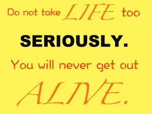
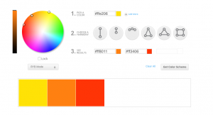
I chose this quote because I don’t like being very serious and I think if you take life too seriously, you won’t be very happy. When I was choosing my color scheme I was trying to pick fun and uplifting colors. I think I did a good job using different fonts to express what the quote is trying to say. I like how I used black to have contrast with my yellow, orange, and red.

I like your quote it makes a lot sense. I like the fonts you chose.
Dear Caroline,
I love your fonts! They are all so different and amusing to look at. I think you really captured your goal of making the colors ‘fun’. You did a marvelous job!!!!!!!!!